The Style Manager allows you to create and manage named text styles that are used in your project.
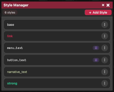
Styles can be applied when Formatting chapter nodes and when placing text elements in the Scene Editor.
Style List
When opened you will see the style list containing a series of style cards. Each card shows a preview of the style using its own CSS rules.
Each style card has a menu containing some options:
- Edit
- Rename
- Duplicate
- Delete
Create new styles using the + Add Style button.

Editing a Style
Style Key
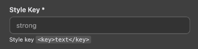
The style key is the name used when applying the style:
<key>Text</key>
Style keys are how you reference a style.
Description

A personal note field for documenting the purpose of the style.
Font

Select a font from the available installed fonts.
See Font Manager for more information.
A live preview is shown when changing fonts.
Text Colour
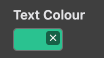
Controls the text colour using the CSS color property.
The colour picker updates this rule automatically.
CSS Rules
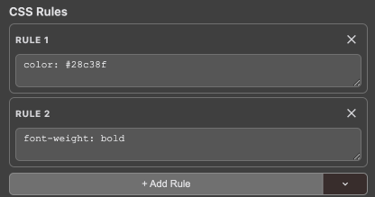
Styles use individual CSS declarations rather than a single block of CSS.
Each CSS rule is added separately, for example:
font-weight: bold;
Rules can be added using the + Add Rule button.
The presets menu provides common styling options:
- Bold
- Italic
- Drop Shadow
- Glow
- Padding
- Rounded corners
- Opacity
- Blur
- Transition
- And more
Animations
Styles can include custom CSS animations.
Each animation contains:
- A name.
- A
@keyframesdefinition.
Example:
from {
  opacity: 0;
}

to {
  opacity: 1;
}
Creating an animation only defines the animation. It does not automatically apply it.
To use an animation, add an animation rule in your CSS Rules:
animation: fadeIn 1s ease infinite;
The Animation Presets menu automatically creates both the animation definition and the required CSS rule.
Available presets include:
- Fade In / Fade Out
- Slide In (any direction)
- Bounce
- Pulse
- Shake
- Spin
- Float
- Flash
Live Preview

The live preview displays sample text using the current style settings.
It updates automatically while editing and includes:
- Zoom controls.
- Light, dark, and checkered background options.
- Hover testing for
:hoverstyles.
This allows you to test a style without opening a scene or running your project.
Special Styles

Every new project includes two special styles:
baselink
Base Style
The base style defines the default appearance of all text.
Unlike normal styles, it does not need to be applied manually.
The base style is automatically applied as the default text style.
Internally, base is compiled as a rule on the application root rather than as a normal .style-base class.
Link Style
The link style controls the appearance of clickable inline link text.
Both base and link can be edited, renamed, or deleted like any other style.
However, they are not available in the Node Editor's tag insertion menu because they are intended to be handled automatically rather than manually added to text.